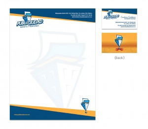
Logo for an advertising distribution company in Cd. Juarez, Mexico named Publiciudad (translates to Publi-city). Concerning the logo, I wanted to include a simple, easy to recognize icon that could be used throughout their company’s image. The icon consists of a fusion between an exclamation mark and a building that respectively represents advertising and the urban enviroment the company serves. I chose blue and yellow as the main palette because of the synergy between the two colors. According to color theory, blue represents loyalty, wisdom and precision which was something that a company that spreads information around a city should represent. Yellow was used because of it’s complementary nature to blue and also as a means to attract the eye.


