Lettering done for left-handed people day. Digital.

Lettering done for left-handed people day. Digital.
2nd deck I painted for my homies @ARTISTA – Check the skateboard art collection and other great artists over at https://www.facebook.com/artistacreative
First time doing acrylics. Some accents were done with sharpies.

An illustration of a man hitting himself drawn and colored directly on a skateboard. A friend of a friend is decorating his living room with several of these boards and invited me to contribute with a drawing of mine!
(Process Shot)

Finished

Illustration/Tattoo I whipped up for a friend of mine. He wanted a tattoo based on his childhood memories of his old house and backyard with crickets chirping and frogs croaking.
(Lines)

(Finished)

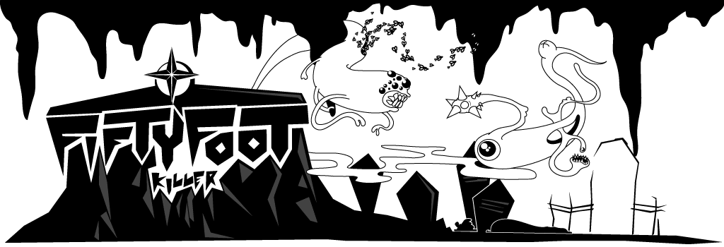
A logo I cooked up for an up and coming skateboard company based off of El Paso, Tx.
Viejo Lobo translates to Old Wolf and is spanish slang for a man that is street-wise and has seen and been through it all. I took my inspiration from vintage cartoons where wolves dressed in zoot suits ogle any beautiful lady that crosses their sight, disney and jailhouse shading techniques (shading done with bic ball-pointed pens). I incorporated the profile of a wolf throughout the logo.

Logo for an advertising distribution company in Cd. Juarez, Mexico named Publiciudad (translates to Publi-city). Concerning the logo, I wanted to include a simple, easy to recognize icon that could be used throughout their company’s image. The icon consists of a fusion between an exclamation mark and a building that respectively represents advertising and the urban enviroment the company serves. I chose blue and yellow as the main palette because of the synergy between the two colors. According to color theory, blue represents loyalty, wisdom and precision which was something that a company that spreads information around a city should represent. Yellow was used because of it’s complementary nature to blue and also as a means to attract the eye.


Sad-clown cliche, it happens.
Charcoal and Photoshop.
Poster for a “you kill ‘em we cook ‘em” BBQ on the outskirts of Austin, Tx.

In an effort to make the site more robust, I will be adding older work from a few years back. Most of these flyers are for shows I did while I was freelancing for The Line Bar.


